Brand identity

Logo and graphic ecosystem

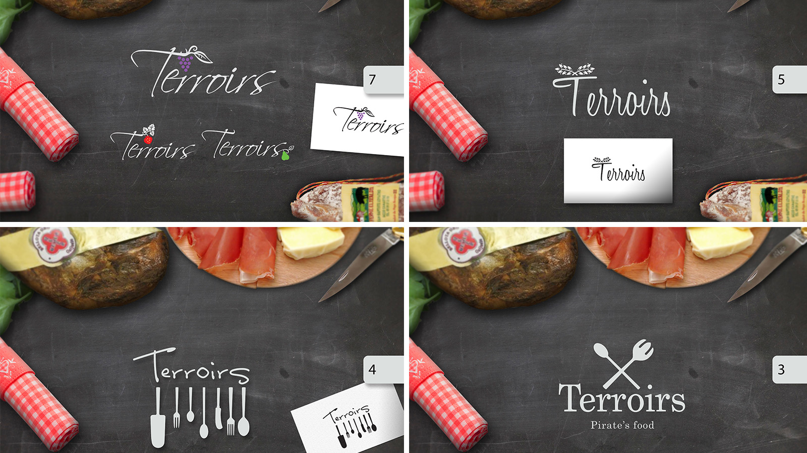
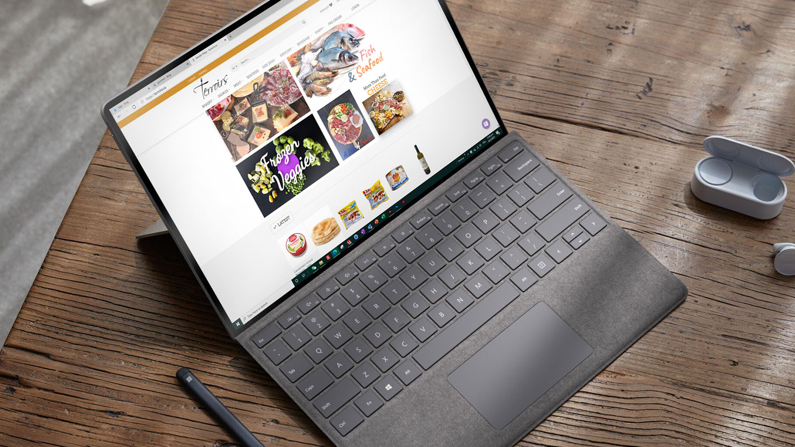
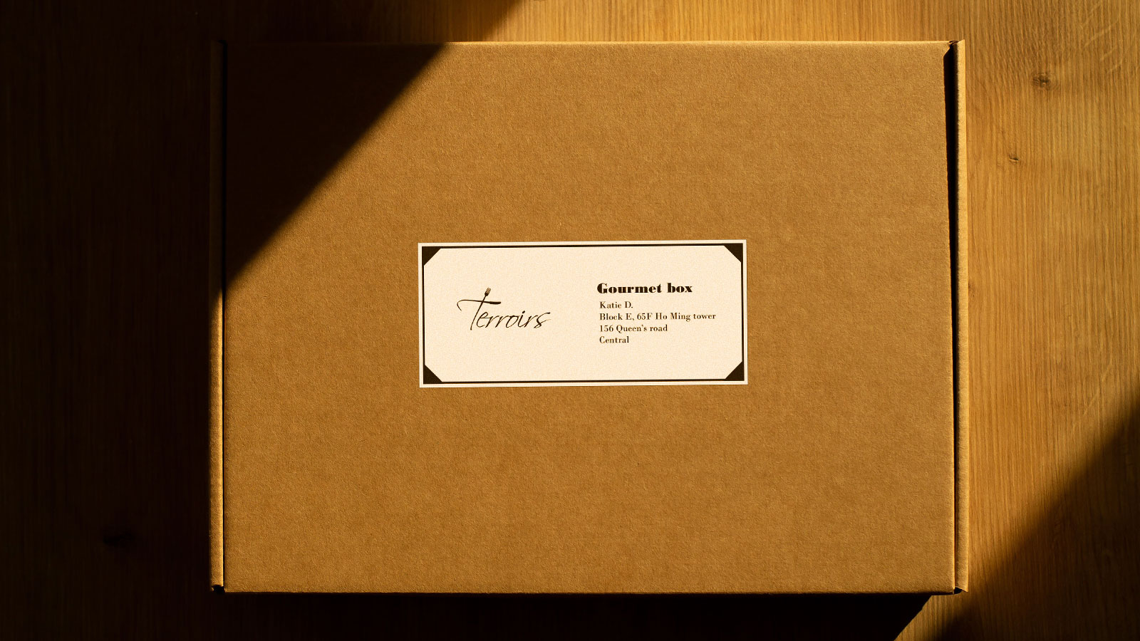
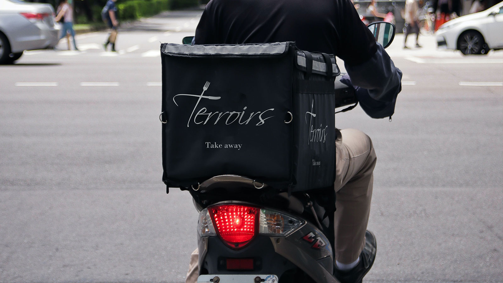
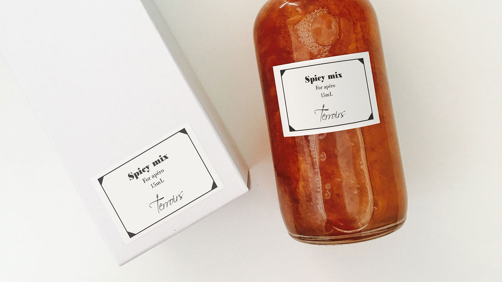
Get fresh delicacies delivered right at your doorstep in Hong Kong was a challenge for this startup. TERROIRS sets itself apart from its competitors by selling imported food carefully curated from fine french artisans and renowned quality brands. In that matter, the identity was built around the products themselves more than packaging decoration that we wanted the less impactful for the environment as possible. Brown box, black ink and manuscript are at the center of the graphic identity.

Brand Terroirs
Client @Terroirs.co
Owner Guillaume Pelca
Role Designer
Other

Packaging

Simple as striking

Simple designed packaging allows the customers to have the products at a cheaper price, thus without compromising the quality of the homemade food or repacked goods.

Fast

And fresh

For the deliveries, the colors are in the other way in order to make it more durable to the city life and daily traffic hustle.

What for

eShop in Hong Kong

By having no human contact except during deliveries, TERROIRS identity needs to be simple and striking. The website was designed afterwards.

The gallery

Project story

A selection of visuals from the project that can include development insights, design process, manufacturing preview, team collaboration or just creative and fun pics. Each project gets its own part of secret stories.